
Designing an art foundation to amplify black voices.
CHALLENGE
How might we design an art foundation that excites and delights while amplifying the voices of marginalized communities? How might we use a challenging sloped site in Los Osos California to entice movement and interaction throughout the project? How might we create a structure that is raw, digestible, and understood by its sense of place?
SOLUTION
yolk is a public art foundation that amplifies the voices of black artists by displaying the works of El Enatsui and Senga Nengudi. The project is derived from simple geometries that have been translated by their implementation within the site. The raw, digestible, and naked approach creates an intimate atmosphere where visitors feel compelled to interact with the art along their journey through cavernous spaces. Spaces are influenced by and capitalize on the use of light, illuminating routes on navigation and showcasing the art in it's finest form.
_Phase Discover
The site came with it's own unique qualities being placed far from the urban city of San Luis Obispo and presenting topographic challenges with a slope above 10% with an abundant coverage of native trees and foliage that we sought to protect. Our team thought about who would be likely to visit this site and who we could be designing for. Additionally, this project was designed amidst the global pandemic of COVID-19 as well as what some might describe as the forefront of Black Lives Matter Movement. These conditions no doubt impacted our own personal goals of the project.
%203.jpg)
Just as the work of our chosen artists embraced an analog attitude towards their work, we did the same. From this point our project became dedicated to the reuse of materials and using analog methods of representation, just like our artists did. The following is a logo we designed for our project. The charcoal drawn symbol contains two layers: the shell representing the outside protective structure of our building, and the yolk, which is the lively heart of our building: the art.
%201.jpg)
_Phase Develop
The next phase of the design process was to bring our formal definitions and goals for yolk into something tangible. Using analog strategies, we sketched, painted, and crafted informal explorations around our goal for the art foundation. How can we hold something that is raw, naked, and digestible? How can we use light to illuminate and drew attention to the spaces created?

Some of the themes myself and Emma pulled from our early discoveries were the layers that come from a hard exterior shell and the gooey interior yolk of an egg. Taking that object a step further, we brought it to the site through plaster and rockite explorations. Emma's discoveries on the left used an egg to guide an additive approach on the site, while my explorations on the right were integrated and cut into the site: a void or subtractive strategy. Emma and I's analog form experimentations were ultimately combined into a hybrid strategy to create the overall form of the project. Integration to and sculpting of the site were extremely important in our narrative.

Using different approaches, Emma and I ultimately arrived at a hybrid composition for the project: both additive and subtractive forms cutting into, sitting on top of, and speaking to the site. Both the forms themselves as well as the strategy by which we sculpted and built earth on the site encourage circulation through the project and help to lead users on a specific journey in order to create an interactive and intimate experience.
_Phase Deliver
Like any successful design project, 2 dimensional drawings are used to better understand parts within our project at the human scale. Here we unpack how to think about moving inside of the building, defining program, and better understanding how to use light to encourage movement throughout the spaces.

In crafting our floor plans, Emma and I thought about which spaces would be best suited for particular programs or pieces of art. For example, on the long curved walls, El Anatusi's textile quilts were best suited for those spaces as Nenguidi's tensile installations were best suited in our double height gallery space as well as in our structural pit located east of the project. The project contains multiple gallery spaces, a cafe, and educational space on black art and cultural history in the San Luis Obispo area and beyond. Users wander and curve through spaces being led from one part to another by the form, light, and the artwork.

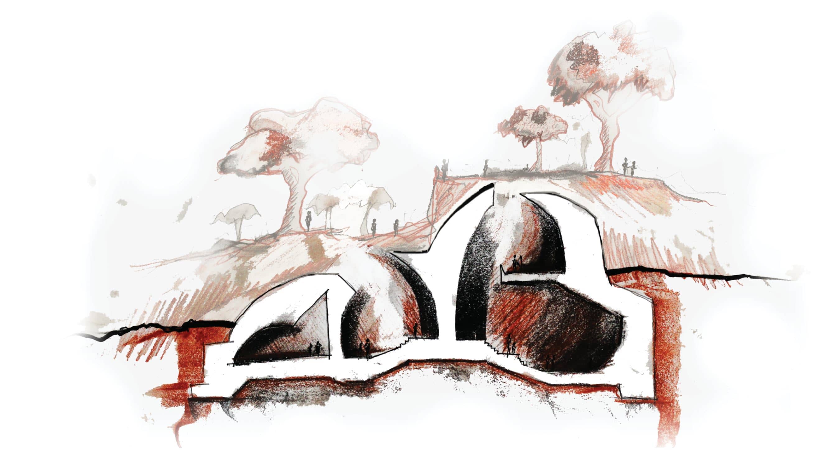
Designing through use of section was one strategy that Emma and I used to understand the differing levels and thresholds between spaces. Through creating sections we better understood how to best use daylight throughout the building and which areas would be darker or lighter. These sections also show our attempt in understanding how the project ties into the ground and moves users from one level to another. We understand the spaces at a human scale and how to create a sense of awe and by manipulating the ground plane and height of each individual space.


Towards the end of our project began to attempt to understand our project on structural level. We explored various construction methods and settled on a layered steel grid construction assembly. It helped us to better understand how this system works by breaking it into layers and looking at in section too.
.png)


